How to Make Sure Product Boxes Go 2-Columns in Mobile View in Elementor; this is very important as 70-80% of eCommerce traffic is MOBILE. Forget about your desktop view for 1 second.
The Problem in Mobile View
white space, looks bad:
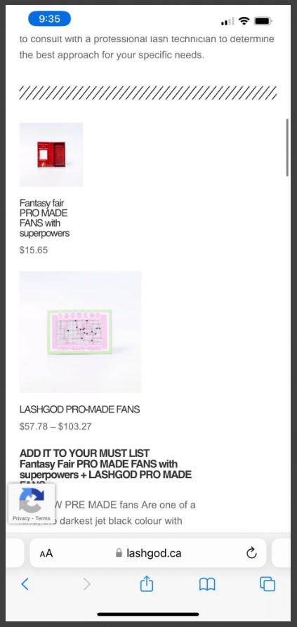
try scrolling through this post with this picture in your on Phone.
It’s a waste of time! Compare this UX to Instagram or TikTok; they know mobile better.
Scrolling down always rewards the user in Social Media.
Step 1 – Edit in Elementor for a simple, 1 x 1 product box element (WooCommerce Product)
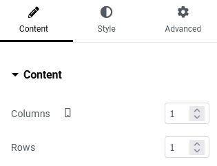
Use Query > Manual Selection to get the product you want to display. (Use Google Chrome for this)
Do NOT need to touch Columns / Rows GAP, that is for when you have a few different products to fit into 1 box
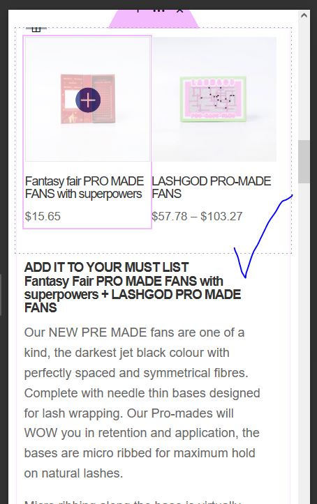
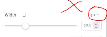
Step 2 – In Advanced Tab > Width > Click on Icon so it’s Mobile > Set width to 49%
95% of folks miss this step or don’t understand it!
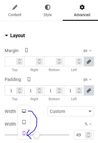
BEFORE:
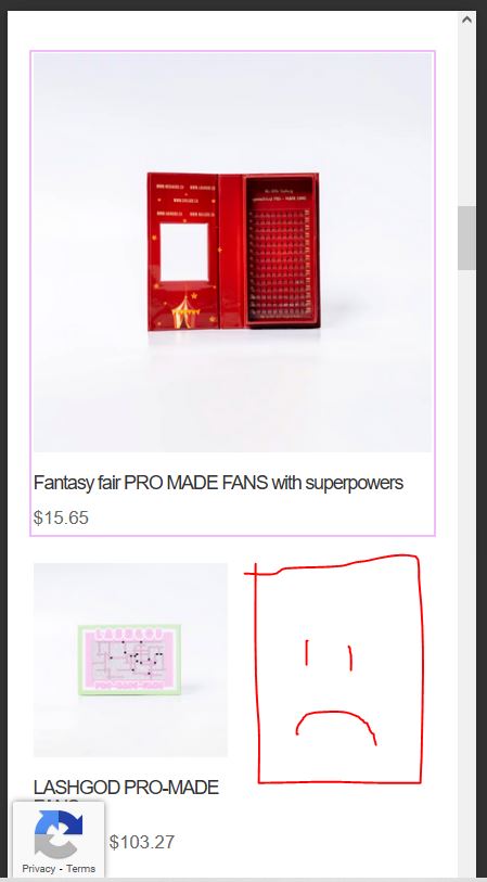
AFTER:
Step 3 – In Advanced Tab > Padding > Set a thin padding so the boxes are not right up against eachother

DONE!
This is a very basic yet mandatory step for making your mobile UX and design make sense!
PS.
Never ever use Pixel hard setting when doing this, bc everyone’s mobile width is different. So we use %, either 100%, or 49% for half of their browser
- WooCommerce Subscriptions Essentials Guide on How to Make it a Subscribe & Save Style - June 17, 2024
- WooCommerce Subscription Plugin Won’t Update with Update Manager, Even After Purchase - June 12, 2024
- How Do I Know Which Products are Frequently Bought Together on my WooCommerce Store? - May 2, 2024